

After 35 years of various visual and tonal identities, The Frick Pittsburgh brand is evolving again.
We contracted with Pittsburgh-based creative studio Bootstrap Design Co. to help actualize our vision for a new look.
Our bold new look aligns with what we've done to transform into an institution dedicated to sharing open and honest conversations through offerings like our Gilded, Not Golden tours.
Learn more about our new brand below.
A logo grounded in personality
For the logo, Bootstrap made custom letterforms that were inspired by typography traditionally used in nineteenth-century stone carvings, which helped ground the brand in history while giving them an opportunity to reinterpret the look with a clean and more contemporary sensibility.
Once Bootstrap established the overall typographic direction, they looked for a way to introduce a distinctive and conceptual detail into the logo. The overlapping of the "R" and the "I" was an intentional choice. By allowing the leg of the "R" to wrap around the "I," Bootstrap created a visual metaphor in which the "I" is placed on display, much like an object in a museum or a house.
Adopting a pop of color
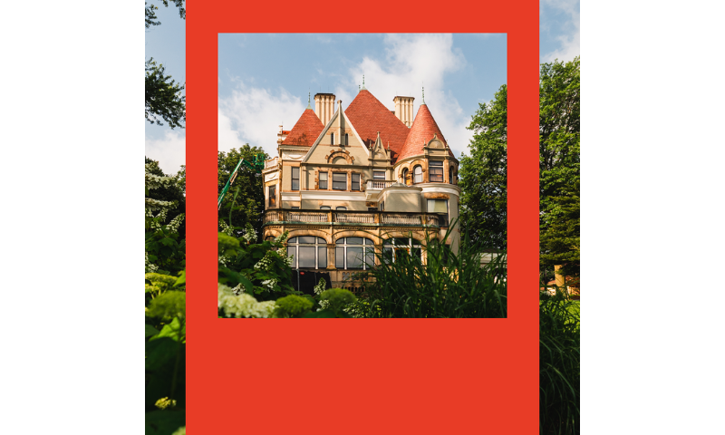
In search of a hero color that is more distinctive and true to the identity of the Frick, Bootstrap looked to Clayton for inspiration. Warm, reddish-orange tones are reflected throughout the whole house—the patina of aged wood, historic textiles, the parlor, and more. Poppy red felt like a natural option for the brand's new hero color.
The red also pairs beautifully with the ground's surrounding greenery while standing confidently on its own as a bold, recognizable brand color.
Finding our voice
In addition to a new visual identity, the Frick also contracted with local writer Kayla Washko to help update our site's voice and tone, including a new tagline. The Frick's Marketing & Communications team, Seth Culp-Ressler, Stephanie Mirah, and Kristin Garbarino, thought about the institution we are today and workshopped ideas with Washko.
The Frick is committed to telling complex stories about the Gilded Age in Pittsburgh. We frame history in a way that ensures our visitors leave with a fuller understanding of the nineteenth century in Southwestern Pennsylvania and how the past impacts us today. The same applies to The Frick Art Museum. Not only is art framed on our walls, but it is framed in critical and thoughtful ways in exhibition text.
A four-word message emerged: History & Art Reframed.
The concept is also brought to life by Bootstrap through red frames. The frame designs draw attention to the stories, details, and perspectives that make the Frick unique.
At the Frick, we invite visitors to experience history and art, reframed for today, through a variety of cultural and historic experiences—all on one campus.